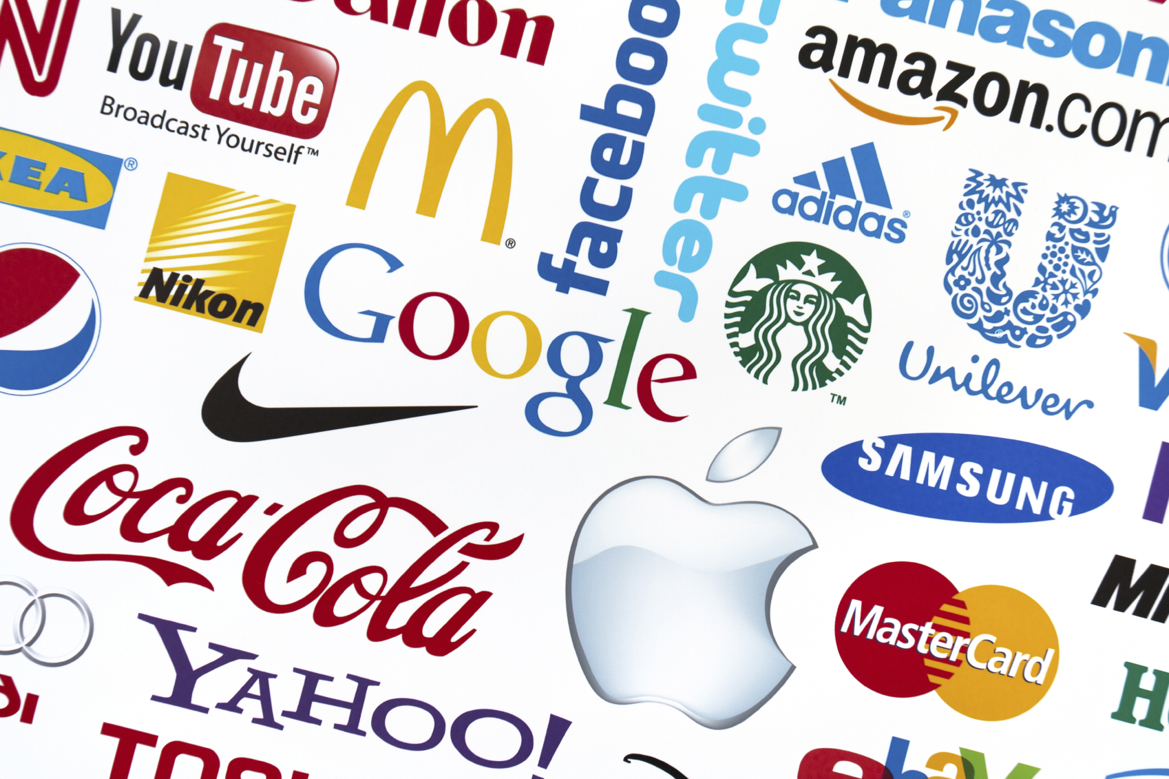
An eye-catching logo is the foundation of a great branding strategy, and logos should be designed in such a way that they endure for years to come. Here we outline some of the essentials of a great logo.
Keep KISS in mind
The KISS principle tells you to ‘keep it simple, stupid’. Avoid creating a complicated logo, as it will distract from what you want to say as well as being difficult to reproduce and maintain. A logo needs to capture people’s attention immediately. Think of it as the ultimate elevator pitch.
Been there, done that
Stay away from overly used themes in your logo, as you want it to stand out from others. Globes, arrows and so on are too often the go-to design for businesses, so think outside of the box.
Don’t be too literal
You don’t have to show what your company does in your logo. (The majority of car brands don’t have actual cars in their logo, and Apple doesn’t have a computer or phone in its logo.) It must be a representation of what you do and your company’s vision.
Bend but don’t break
A flexible logo is essential, since you want it to be recognisable and to evoke the same feelings no matter where it is used. It should be adaptable enough to be used in any media and not have to change drastically every time.
Also, remember that changing the size of your logo is going to be inevitable depending on where it is shown. It should be able to look the same whether displayed on a billboard or a letterhead.
Stand head and shoulders above the rest
Differentiate yourself from the competition. You might think that aligning your company with a more successful competitor may make you successful by association; however, you need to stand out from the rest in order to be noticed.
Steer away from similar designs and colours as used by companies that you’re competing against, otherwise customers may have a hard time separating you from them.
Ignore the cool kids
Designing a logo based on what is trendy and hip right now will make your brand outdated very quickly.
You will notice that most companies that have been around for decades have never changed their logo. They may have refreshed the colours and outlines here and there, but the premise of the logo has remained the same. Emulate these behemoths and design a logo that will look fresh and remain relevant over time.
Send a message with your colours
We recently did an article on the psychology behind colours when used in product packaging. The article showed how colours can influence how people think about a product or company, even if they are not aware that this is happening. Your logo is no different.
Think carefully about the colours that you use, as this may send out a different message than you intended. The colours you use should not be about what you like, but about how you want your company to be perceived.


