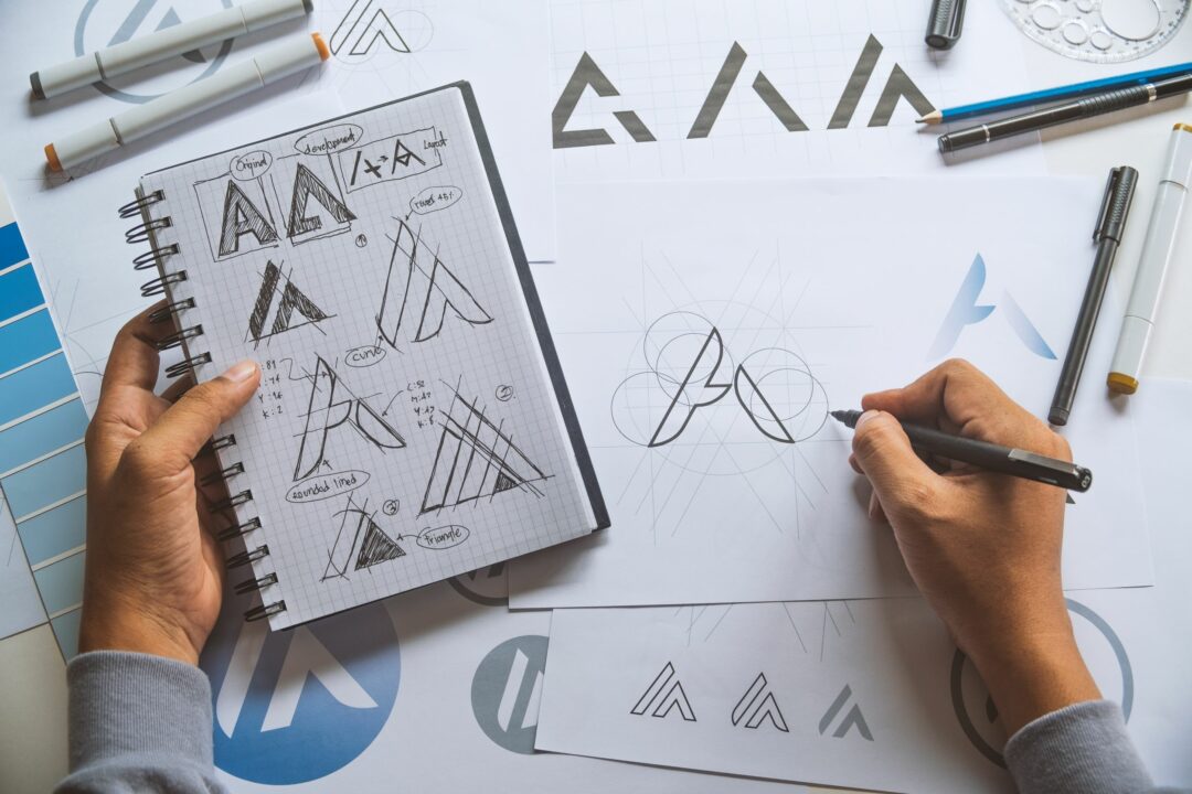
Simply put, graphic design is the visual representation of a brand’s message. It includes all visual aspects of branding such as typography, symbols, images, colours, and shapes. Graphic design is more than just aesthetics; it is a means of communication between a brand and its target audience. Businesses use graphics in almost every stage of the marketing funnel to inform, engage, and persuade.
Why thoughtful graphic design is important
Graphics speak to us on a subconscious level. Why are warning signs typically coloured red? What is it about luxury brand logos that spark this idea of luxury? Whether we know it or not, we take in all this graphical information and make associations that influence how we perceive brands.
Graphic design serves as a means of brand awareness. Think of famous brands and think about how many just need its logo to be recognisable. Look at their adverts and their websites. Is there anything that feels like it makes sense being there, visuals-wise? Often, we don’t really know why visuals make sense, but we know when it does, and we can feel when something is off.
When it comes to first impressions, it is most often the graphics that catch our attention. Immediately, without needing to explain anything, a potential customer can get a general sense of the personality of your brand, what it is all about, and what its message is. See a predominantly green and brown colour scheme with probably images of fields, the sea, or soil and you have already surmised that a brand pays attention to the environment regardless of prior knowledge. The role of graphic design is to communicate a message visually, that draws in customers and makes your brand visually distinct or recognisable.
Some simple tips
While a dedicated graphic designer may be more competent at graphic design, not everyone may have the means to hire one. When starting out, there are a few key and simple design decisions that may work in your brand’s favour without the need for complex graphic design knowledge.
The core of a brand is its message. Graphics are there to portray its message. A fundamental element of graphic design is colour theory. Fret not, we will not go into the nitty-gritty details of colour which you may find elsewhere. Find a colour that defines the baseline of your brand. From there, create a theme. Different colours convey different meanings. Find secondary colours that either complement the primary colour or contrast it. Experiment with different shades and hues to produce the right theme. Do not include too many colours. You want to create a striking, distinct visual image, not confuse or overwhelm your audience.
Space is a powerful tool for focusing your audience’s attention on specific aspects of your graphics. Good spacing increases legibility and allows you to guide your audience’s attention in a specific order. When people tend to skim text, good graphic design will space things in such a way that the spacing ensures that skimming leads the eyes towards certain sentences. This is the reason why headings are often in a bigger or heavier font and listed items are indented. For further cohesion, group like elements together. You can emphasise your brand’s visual message by grouping elements that convey the same meaning together.
While font is often overlooked, it too carries personality. It forms part of the wider graphic design concept, typography which also includes word layout and colour. A font can often seem out of place if it does not fit quite well with the rest of the brand’s image. Use, at max, about three different fonts. As is with colour, you want to create a visually distinct look and not barrage audiences with too many confusing fonts. For more diversity, instead focus on the weighting of fonts such as light, regular, or bold to mix things up and accentuate different parts. The fonts should be legible on many kinds of media. What works on one platform should work on others.
The basis of good graphic design is consistency. A brand can be very distinctive on each of its platforms, but if the visual branding is not congruent, not many may draw the connection, and this results in isolated audiences. When your customers receive a newsletter, they need to immediately know it comes from your brand. Consistent graphic design leads to consistent messaging. This is the reason it is recommended that your design works on a variety of platforms and media.
However, as simple as these tips may seem, in practice it might not be so. There is a reason graphic design is a viable profession. Brand designers still need to put proper thought into the visual elements of their brand across all channels. The best way to become more familiar with the technicalities is by looking at other’s graphic designs or by studying those techniques. Then again, there are graphic designers for that.


